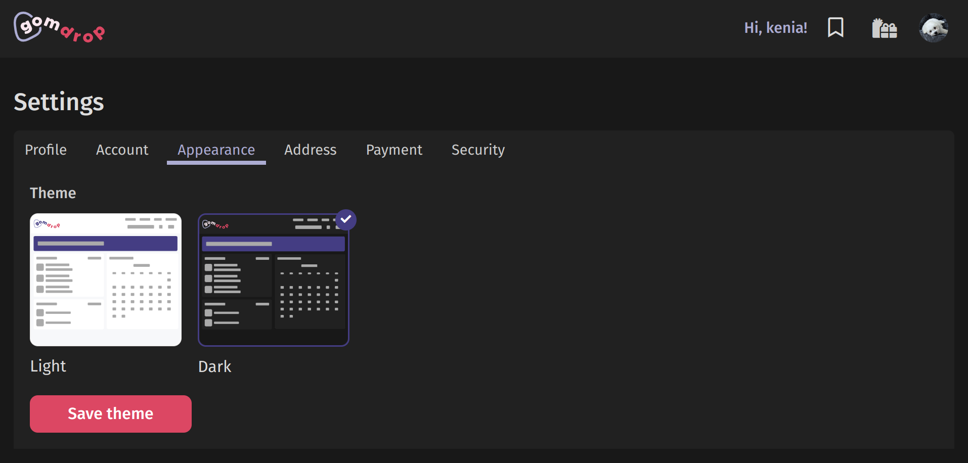
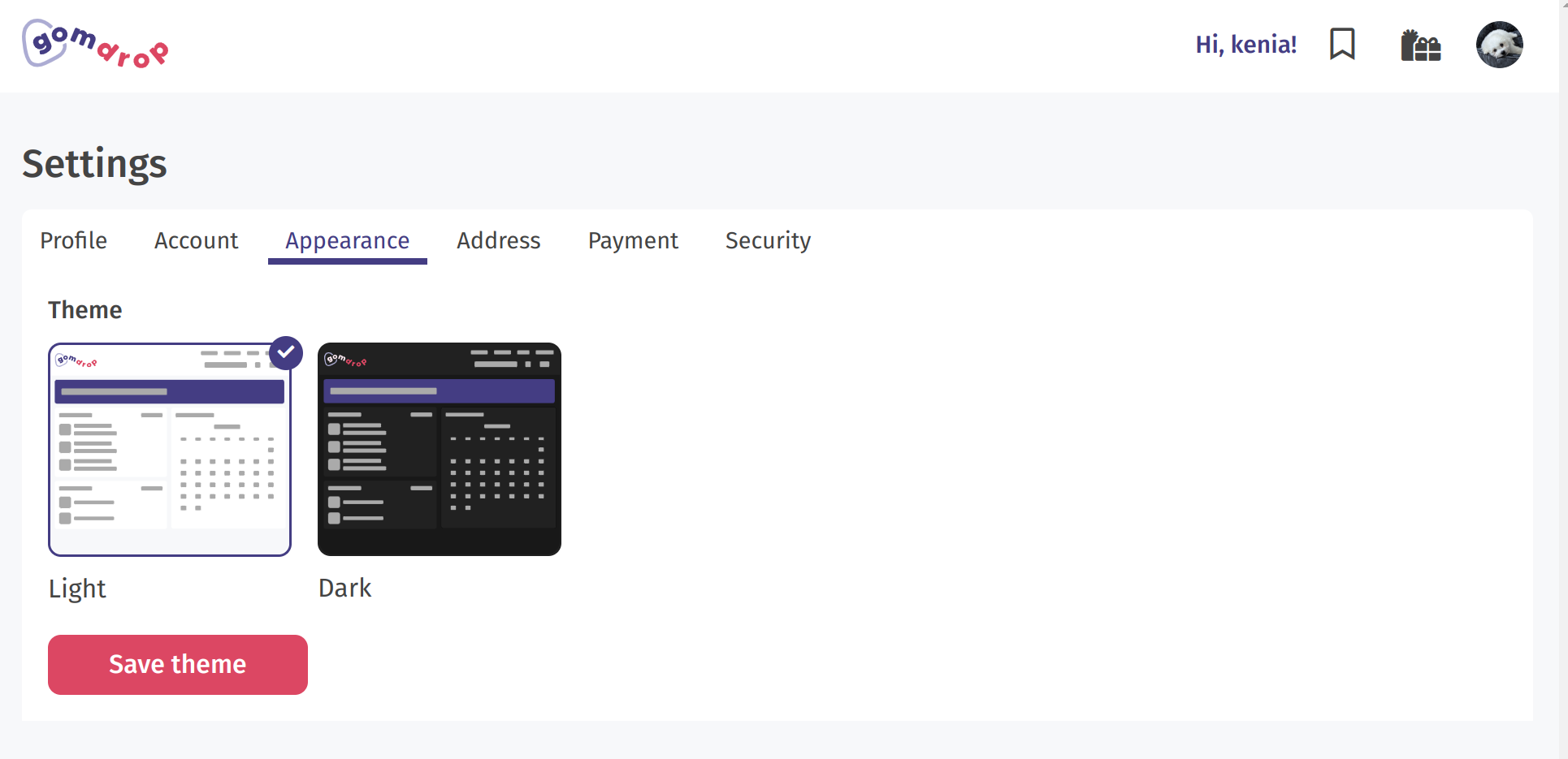
Themes
Personally, I always choose to use a dark theme over a light one if possible. This was a quick feature that also allowed us to lay down some scaffolding for a future custom themes feature.
Custom theme icons were created using Adobe Illustrator and Figma.
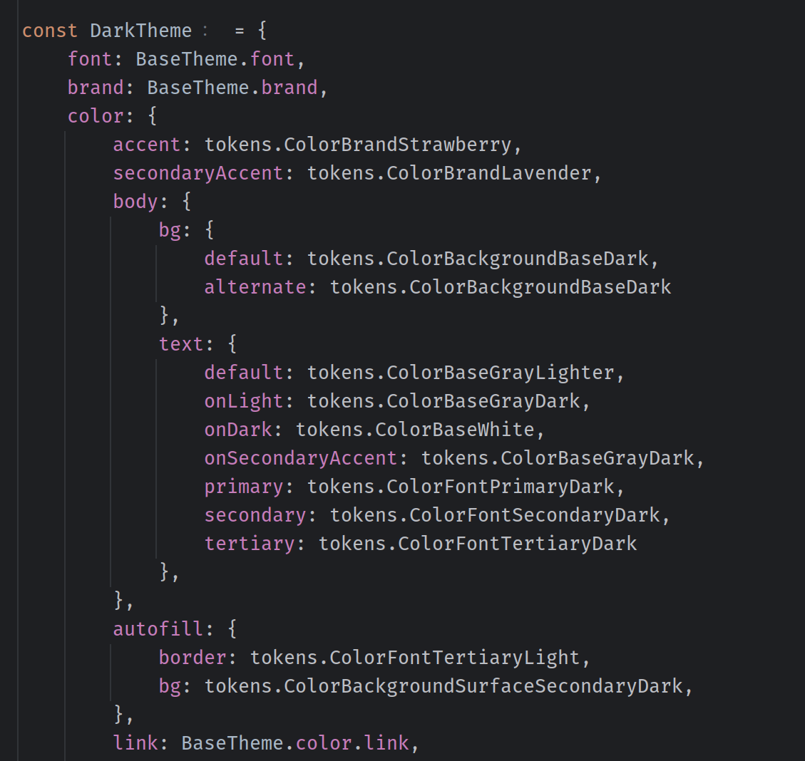
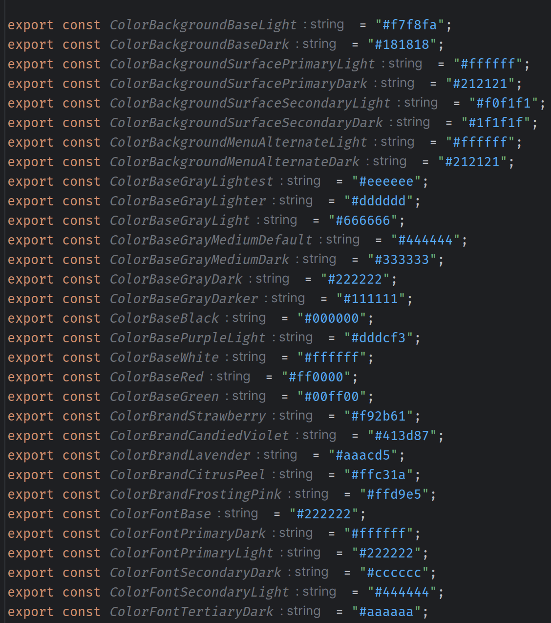
It was important to create design tokens that can be shared across platforms and that can be easily interpreted by developers. My first instinct was to just toss some hex codes around and call it a day, but in order to create a theme feature that could scale into something more creative, it was necessary to sit down and actually think about what each color was actually accomplishing in the theme.
Though the design tokens I created were enough for our current 2 themes, I am far from satisfied with the system as a whole. More work and research is necessary to ensure that GOMdrop's design system is cohesive.
After creating the design tokens I used Styled Component's theme provider to pass in the user selected theme. An additional context is used to fetch and set themes.
After the theme is selected, it is stored in the user's cookies. This allows us to access the theme upon them accessing the site. Themes are also stored in the user's document in our Mongo database.
Currently over 10,000 users have enabled the dark theme.